
Newsletter November 17, 2026
Getting the True Color of Your Wax in Product Photos
Sometimes what looks perfect on a screen is wrong in real life. We'll look at how professional tools help you ensure that dye batch or fragrance color truly pops, not just online.
The gap between my camera screen and reality
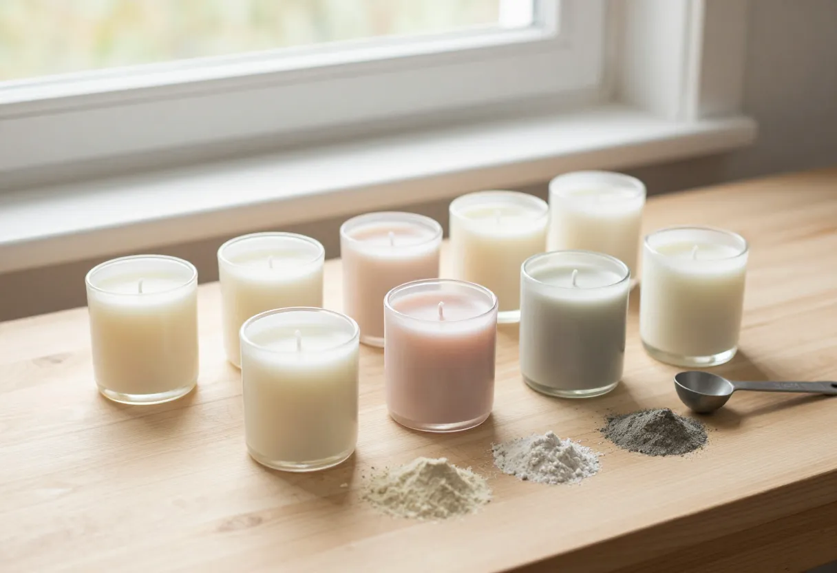
I’ve spent a lot of time at my workbench looking at finished candles, and I know how frustrating it is when the physical product in your hands doesn’t match what you see on your phone or laptop. It’s a common hurdle for makers who are starting to sell their first batches online. You pour a beautiful batch of wax dyed a specific shade of sage green, but once you snap a photo and upload it to an online shop, that same sage looks like a muddy olive or a bright neon in the preview.
This discrepancy usually happens because cameras don’t see light the same way our eyes do. A camera sensor interprets color based on its own internal settings, often exaggerating certain tones while muting others. For candle makers using dyes, this is even more complicated because wax and dye interact with different types of lighting in unpredictable ways. If your photo doesn’t accurately represent what you shipped out to a customer, it leads to “not as described” complaints or, worse, a loss of trust from the people trying to support your new business.
When standard editing isn’t enough (and what ‘color fidelity’ means)
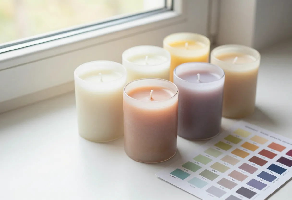
A lot of makers try to fix this by simply cranking up the saturation or brightness in a basic photo editor. I’ve seen it done, and while it might make the candle “pop,” it rarely solves the underlying problem of color accuracy—or what we call “color fidelity.” Color fidelity is about ensuring that the hue (the actual color) remains consistent regardless of whether you are looking at the candle under a warm kitchen light, a cool window light, or on a backlit smartphone screen.
This is where more technical concepts come into play. In professional photography, tools like a vectorscope help identify if colors are shifting in tone across different environments. For us makers, the goal isn’t necessarily to own high-end studio equipment, but to understand that “more color” isn’t the same as “correct color.” If your blue candle looks purple in one photo and teal in another, a saturation boost won’t help; you need a way to ensure the base hue is being captured correctly before you even start editing.
Applying color accuracy to your workbench
On my own bench, I’ve learned that light isn’t just something that hits the candle—it’s something that changes how we see it. If I photograph a batch of wax while standing in the direct sunlight from a window, and then look at those same photos under my shop’s overhead LEDs, the shift is immediate. This happens because different light sources have different “temperatures.”
To get closer to true color accuracy for your batches, you need to account for these shifts during the production phase:
- Check your dye while warm: Sometimes a wax batch looks one way when it’s still hot and liquid but settles into a different tone as it cools and sets.
- Test multiple light sources: Take a sample of your dyed wax and look at it under both “warm” (yellowish) and “cool” (bluish) lights. If the color shifts drastically, you know that specific dye might be temperamental in photos.
- Consistency is key: Choose one primary lighting setup for your product shots and stick to it every single time. This ensures that if a customer sees five different candles from your shop, they all look like they belong in the same collection.
The best practices: A checklist approach
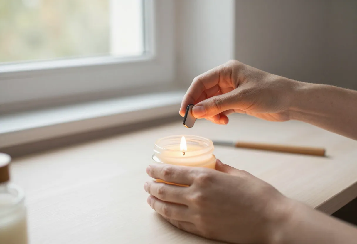
I’m a big believer in using checklists—it keeps things organized and prevents small mistakes from turning into bigger problems later on. When you’re getting ready to photograph your new batch of candles, I recommend following this disciplined workflow to minimize surprises during the post-processing phase.
Photography Preparation Checklist
- White Balance: Ensure your camera or phone is set to a consistent white balance. If it’s on “Auto,” the camera will constantly try to “correct” the color based on what it thinks is white, which can cause your wax colors to drift between shots.
- Fixed Lighting: Use a dedicated light source (like a softbox or a constant LED) rather than relying on natural window light, which changes every minute as clouds move or the sun shifts.
- Sample Comparison: Keep a “control” candle—one you know looks perfect in your shop’s lighting—next to your new batch while you take photos. This helps you see if the camera is treating different colors with the same level of accuracy.
- Multiple Angles: Take shots from several angles to see how the wax reflects light differently on the curves of a jar or the sides of a pillar.
Next steps for your photography routine
Getting your product photos to match reality takes some patience and repetition, but it’s one of the most important steps in building a professional-looking brand. It’s about making sure that when someone buys from you, they get exactly what they expected to see on their screen.
If you’re just starting out with your first batch, I recommend getting your fundamentals down before worrying about high-end editing. Start by focusing on consistent lighting and clear photos of your containers and labels. For more help with the technical side of things, check out our guide on /guides/candle-photography-explained/. If you need to scale up your production or get your math right for new dye batches, you can also use our /tools/batch-scaler/ or the /tools/wax-calculator/ to ensure your colors stay consistent across every pour.
Inspired by a story from PetaPixel.
Get the next issue
Questions or corrections? Send a note. Or read more issues.