Newsletter October 27, 2026
How to Make Your Product Look Expensive (Without Being One)
Sometimes the best upgrades aren't to your wax or wicks, but to how you present what you already make. We cover visual merchandising principles that justify a premium price point.
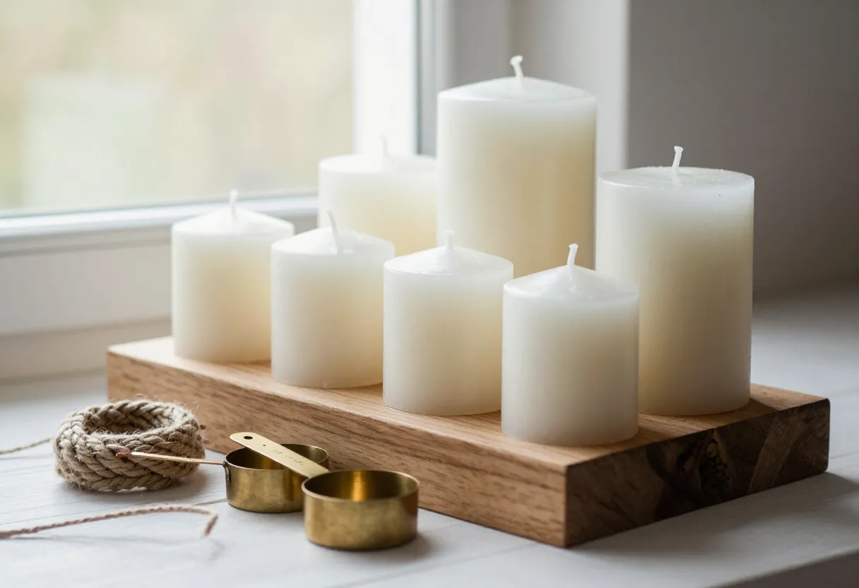
The Illusion of Luxury: It’s About Curation, Not Cost
I used to think that making a product look “high-end” meant spending more on the materials—getting the thickest glass or the most expensive gold foil labels. After years at the bench and observing how people interact with products, I’ve realized it is less about the price tag of your components and more about curation. It is very similar to home organization principles; think about a well-organized laundry room or a pantry. When things are grouped logically, have enough “breathing room” (negative space), and follow a consistent visual theme, they look intentional.
In candle making, this means less is often more. If your labels are cluttered with too much information or your containers vary wildly in shape without a unifying thread, the brand feels scattered. I’ve found that choosing a limited color palette and grouping products by scent family or collection creates an immediate sense of professionalism. You aren’t trying to trick people into thinking you spent a fortune; you are showing them that you have a disciplined, organized approach to your craft.
Packaging That Tells a Story
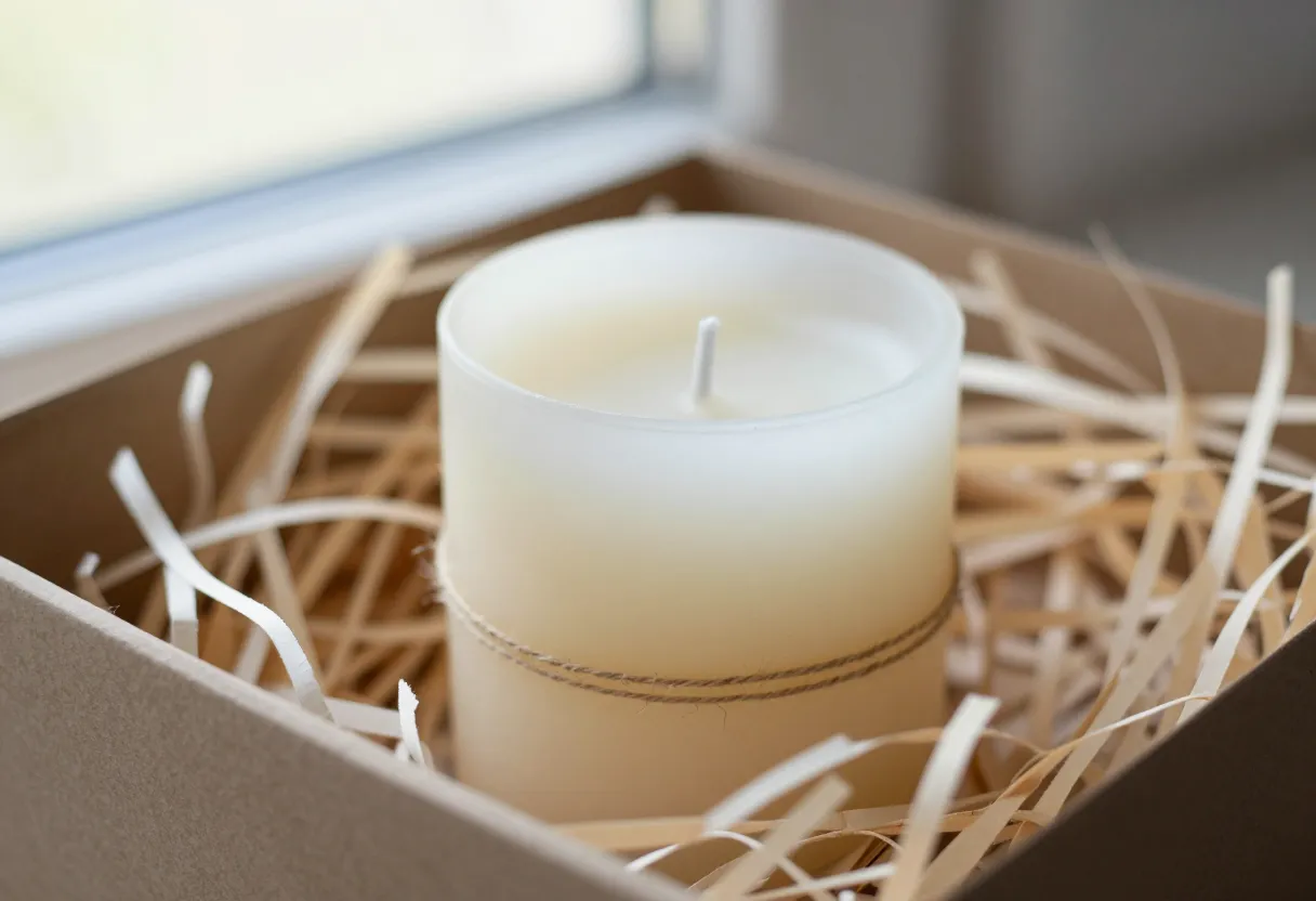
When a customer receives a package, the “unboxing” experience is their first physical interaction with your brand before they even smell the wax. I’ve learned through trial and error that flashy, multi-colored prints can sometimes cheapen a product because they distract from the candle itself. Instead, I lean toward natural, simple elements that suggest quality through texture rather than brightness.
Material Choices
- Boxes: Use sturdy cardboard with a matte finish. It feels substantial in the hand and suggests durability.
- Filler: Consider using shredded kraft paper or wood wool instead of plastic-based “crinkle” cut. These materials provide a tactile, organic feel that aligns well with handmade goods.
- Ribbons: A simple cotton or linen ribbon tied in a clean knot often carries more weight than a shiny polyester one.
The goal is for the packaging to support the candle’s story without shouting over it. Every piece of material should serve a purpose—protecting the jar, providing a handle, or offering an opening experience that feels deliberate. For more on how to structure your shipping materials, see my guide on /guides/candle-shipping-and-packaging-explained/.
Displaying Beyond the Jar (and Making Tools Look Good)
If you are selling at markets or have a dedicated display area, how you arrange your products—and even your accessories—matters. A common mistake I see is “cluttering” a table so much that the customer doesn’t know where to look first. You want to create a visual hierarchy. Use trays, tiered stands, or wooden crates to group items. This creates defined “zones,” which makes it easier for a buyer to navigate your offerings.
Making Tools Intentional
Even if you aren’t selling your tools, having them visible in a retail setting can be part of the brand story. If you have wick trimmers or pour pitchers on display, they shouldn’t look like junk left out by accident.
- Group by function: Keep all cutting tools together and pouring vessels together.
- Use uniform containers: Place smaller items in small jars or bins to keep the workspace looking tidy.
- Focus on cleanliness: A polished tool looks like a professional choice; a dusty one looks like an oversight.
By organizing your display with these principles, you signal to the customer that you are a maker who values precision and order.
The Photography Angle: Staging Your Brand
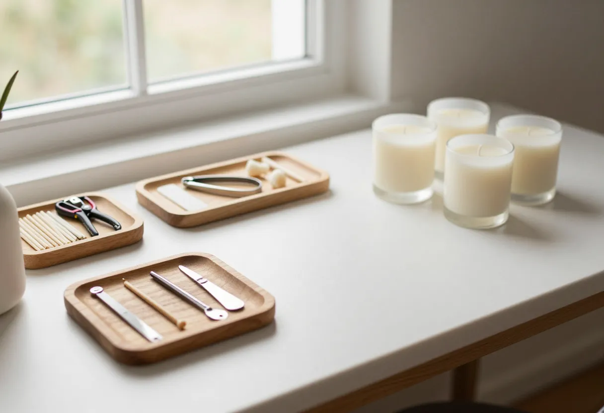
The physical setup we discussed in the previous sections is the foundation for your photography. When I take photos of my batches, I’m not just looking for a “pretty” shot; I’m trying to capture the same sense of curated space that a customer would see in person. If your brand feels organized on a shelf, it needs to feel organized in a photograph.
Staging Tips
- Control the Clutter: Before you start a shoot, clear everything from the background that isn’t part of the “story.” A stray piece of shipping tape or a messy pile of labels can break the illusion of a premium brand instantly.
- Use Props with Purpose: If you use props like dried botanicals or fabric textures, ensure they relate back to the scent profile of the candle.
- Depth and Layers: Arrange your candles at different depths in the frame. This mimics how people naturally view items on a shelf or table.
Good photography supports premium pricing because it shows that you’ve put thought into every detail of the presentation. For those looking to refine their visual content, I recommend checking out /guides/candle-photography-explained/.
If you are ready to start refining your own brand’s look, you can use the /tools/label-builder/ to begin organizing your visual identity.
Inspired by a story from Sunset Magazine.
Get the next issue
Questions or corrections? Send a note. Or read more issues.