

Newsletter November 5, 2026
Making Your Candles Look As Good as They Smell
It's not enough just to make a great candle. This issue covers how placement, grouping, and hardware can drastically affect your perceived value on the sales floor or online shop.
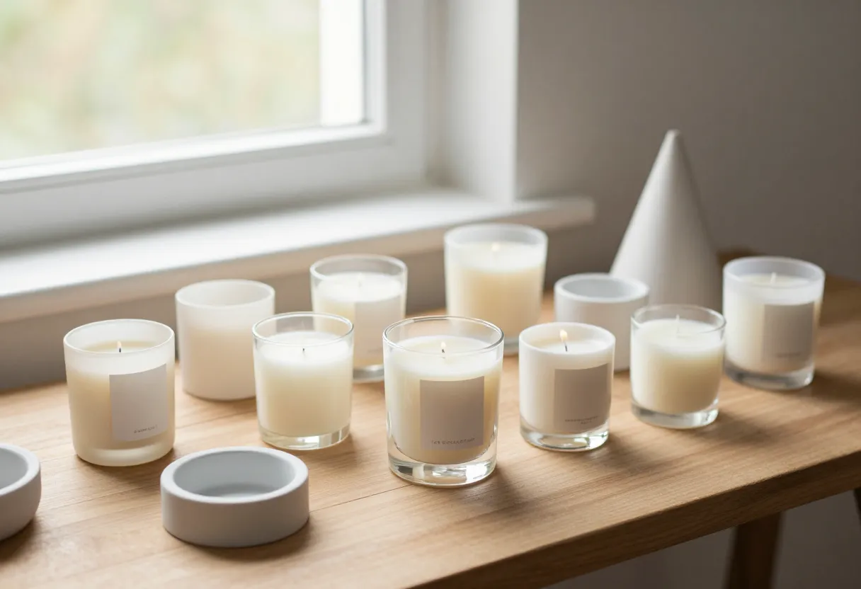
Presentation isn’t just pretty pictures—it’s part of the product.
When you are at your workbench, it is easy to focus entirely on the technical side of things: getting the fragrance throw right, ensuring a clean melt pool, and perfecting your pour technique. But once that candle leaves your hands and heads toward a customer’s home, the presentation becomes just as important as the chemistry inside the jar.
I have seen many makers produce high-quality candles that struggle to sell because their visual staging doesn’t match the quality of the wax or the scent profile. If your photos look cluttered or “cheap,” customers will assume the product is cheap too. Staging—or visual merchandising—is a critical skill in this industry. It’s about creating an environment where the customer can see how that candle fits into their life. You aren’t just selling a jar of wax; you are selling a mood, a memory, or a moment of relaxation. If your presentation doesn’t communicate that clearly, it is much harder for a buyer to justify a “high-end” price point for your work.
Figure out your aesthetic zone first. Don’t mix them up.
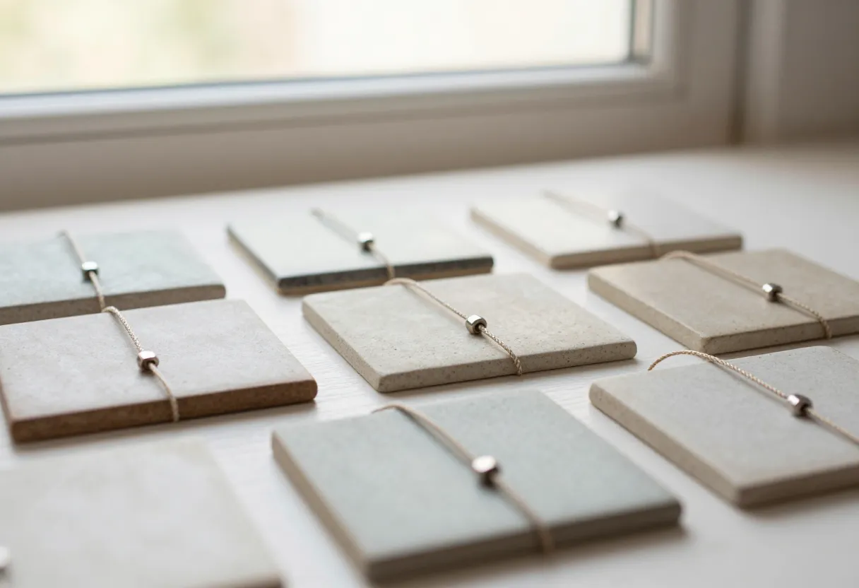
One of the most common mistakes I see from makers starting out is trying to appeal to everyone at once by mixing conflicting design styles in their marketing materials. If you are trying to sell a candle that fits into an Art Deco interior, but your staging looks like a rustic farmhouse, the customer gets “visual noise.” They aren’t sure who the product is for.
To avoid this, you need to pick a lane and understand its rules:
- Art Deco: Focuses on geometric shapes, bold lines, and high-contrast materials like gold, chrome, or marble. Symmetry is often key here.
- Zen/Minimalist: Relies on simplicity, natural textures (like stone or wood), and plenty of “negative space.” The goal is to let the candle be the sole focus without distraction.
- Eclectic: This allows for more variety but still requires a unifying thread—perhaps a consistent color palette even if the shapes vary.
Before you grab your camera, decide which “zone” your brand lives in. Once you pick it, stick to those principles across all your photos and descriptions. It makes your brand look disciplined and professional.
The common mistake: Treating accessories as random props.
In my experience—and this often comes down to the same kind of discipline I learned in the Marine Corps—every item in a frame should have a reason for being there. A lot of makers grab whatever is lying around their workshop or house to “fill out” a photo. This leads to “random prop syndrome,” where you have a candle next to a stray remote, a mismatched book, and a piece of driftwood that doesn’t seem to belong anywhere.
Good styling requires intentionality. You want your accessories to support the candle, not compete with it. If you are using props, they should share at least one unifying element. This could be:
- Material: Using only brushed metals or exclusively matte ceramics.
- Color Palette: Keeping every prop within a specific range of neutrals or earthy tones.
- Height Variation: Ensuring that the items around the candle aren’t all the same height, which can make a scene look flat and uninteresting.
If you find yourself looking at a photo and wondering why an object is there, take it out. If the scene still works without it, it wasn’t doing its job.
How to group candles and holders for maximum impact (the ‘discipline’ approach).
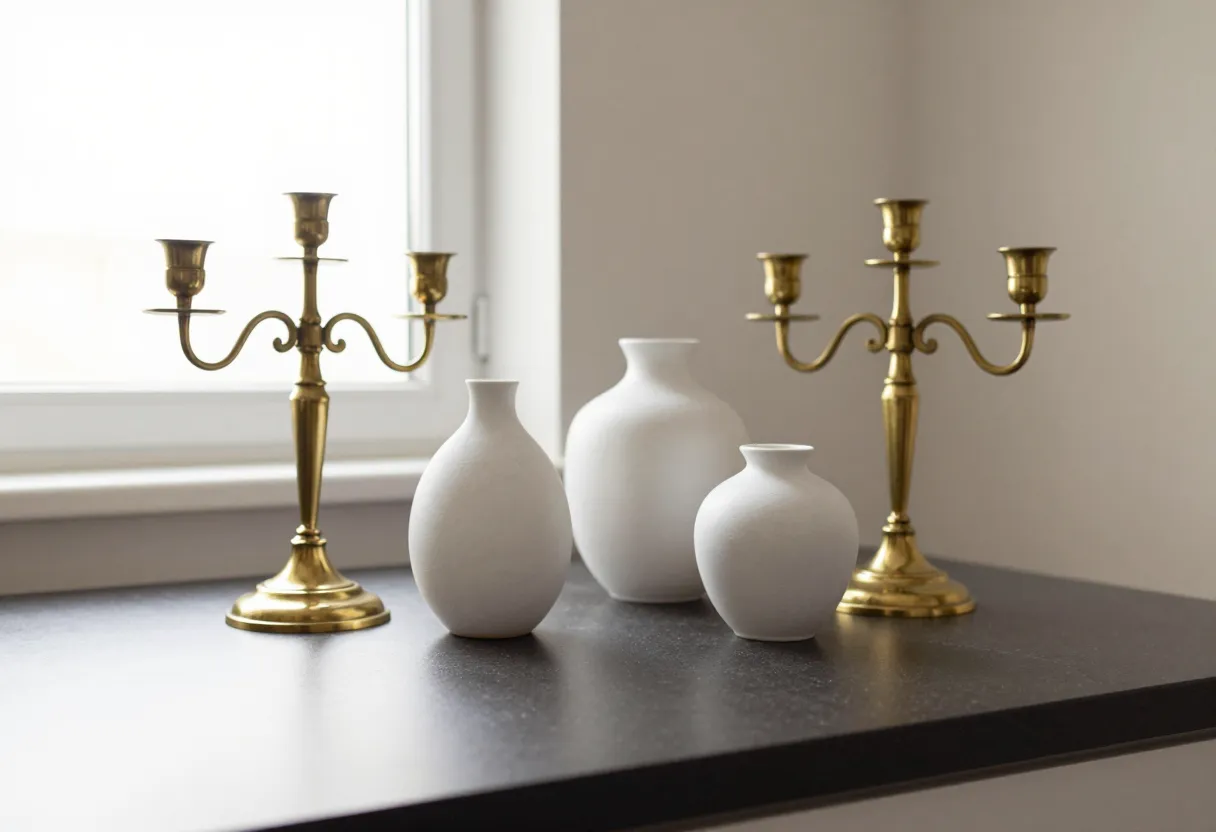
When you are staging multiple items—like different sizes of jars or various candle holders—you want to arrange them in a way that feels balanced but not forced. I find the “rule of three” is a reliable starting point, as odd numbers often feel more natural to the eye than even pairings.
Here is a practical way to group your items for a high-end look:
- Establish a Focal Point: Choose one primary candle (usually your best seller) to be the centerpiece.
- Vary the Heights: Place taller items in the back and shorter ones in the front. This creates depth and allows every label to remain visible.
- Mix Textures, Not Styles: You can have a smooth glass jar next to a rough stone holder, but they should still feel like they belong in the same room.
- Controlled Clusters: Instead of lining candles up in a straight row (which looks like a grocery store shelf), cluster them at slight angles. This creates “movement” in the photo and feels more like a curated home display.
By applying this kind of structured approach, you move away from “random” and toward “designed.” It shows the customer that you have put thought into every detail of your brand.
From bench to workshop: Making your candle design fit the scene.
While staging is what happens after the pour, the best way to ensure a high-end look is to build it into the product from day one. If your goal is a luxury aesthetic, that should be reflected in the physical components you choose during production.
Consider these elements when you are planning your next batch:
- Jar Shape and Weight: A heavy glass jar feels more substantial in a customer’s hand than a thin, lightweight container. This “heft” translates to perceived value immediately.
- Label Material: Think about the texture of your labels. A matte paper label might fit a farmhouse vibe, while a metallic foil or a high-gloss finish might be better for an Art Deco style. You can use our /tools/label-builder/ to start visualizing these options.
- Wax Color: Sometimes even the color of the wax matters. A creamy off-white can look different than a stark white, and that choice can subtly shift how your candle sits in a high-end display.
Your goal is for the product to be “shelf-ready” before it ever hits a prop table. When the jar, label, and scent all tell the same story, your staging becomes much easier because the product is already doing the heavy lifting. For more on how to capture these details correctly, check out our /guides/candle-photography-explained/.
If you are ready to start refining your brand’s look, you can explore our shop for container options or use our pricing calculator to ensure your high-end presentation is reflected in a sustainable price point.
Inspired by a story from Apartment Therapy.
Get the next issue
Questions or corrections? Send a note. Or read more issues.